2018
Tascón Diagonal
Tascón Shoe Shops
Diagonal Ave 462, Barcelona
Photo © Salasstudio

It was in 1982 when Carlos Tascón made me the first assignment. He already had other shoe stores, under the brand name Calzados Esla –name taken from the so-called Esla river, the most abundant tributary one to the Douro river.
We could say that, unintentionally, I assigned myself the naming of the brand, coming up with his own last name, Tascón, as it proved forthright, sonorous. And on its Spanish meaning, if we have a bit of humour sense, it suggests to a certain part of the footwear –the heel, in Spanish tacón.

It has already been 36 years together, and as one can imagine, the ways of interpreting a space have evolved a bit. Do not misunderstand it: Tascón stores have moved forward to become more fresh and organized than before.
At a certain age one starts filtering and purifying many things, but there is always a free spot left to the leisure, the mischief. As an architect friend of mine once said, “once we are aged we should give ourselves certain licenses, even contradicting ourselves”. Now one feels himself wiser and seeks the essential with a few drops of humour, irony, and respect to the preexisting. A bonus we give not only to the rest, but also to our delight. For instance, a visual poem putting in value the vestiges of the past (added as a new use element) could evidence the perfect coexistence between past and present.

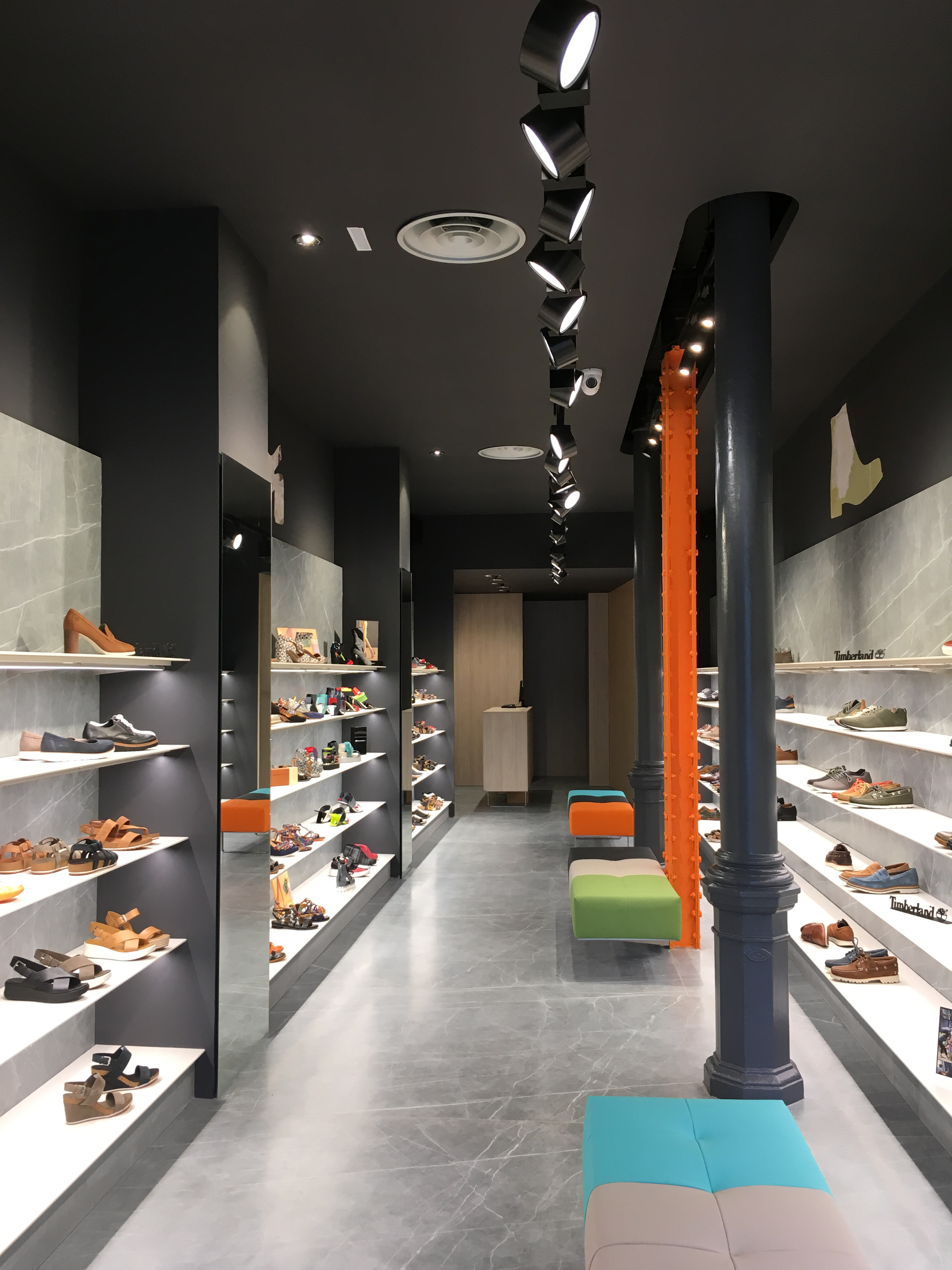
At the Diagonal Avenue’s Tascón Store we notice the traces from the former Esla store –the amazing textures and chromatic nuances of the existing walls. That suggested me to partially add them to the new project as silhouettes of different shoe models on a black background creating (together with the ceiling in that same color) the “lid” of the metaphorical shoebox that the project’s idea started with. The exhibition space (made with shelves hanging from the walls) represents the container of that imaginary shoebox, and it is conceived with Neolith Zaha Stone cladding, used both for the floor and the walls, giving a feeling of buoyancy.

The façade is left with the existing grey granite cladding, framing the perimeter of the store’s access with an iron plate painted in anthracite grey; complemented with the Tascón illuminated sign on rabid orange, held by an electric green, horizontal tray; and two glazed pivot doors that on the store’s opening hours become showcases on both sides of the entrance.

The graphic, then, has presence on both entrance doors’ crystals, representing two footprints of feminine and masculine footwear, respectively, leaving the footprint shapes as transparent on a translucent matte vinyl background. Through those transparent shapes one can observe the showcase’s interior or, otherwise, the store itself when those remain closed.

The benches (three, as the existing pillars) are designed specifically for the store. Those are made by thick volumes of upholstered foam on different colors and stainless steel supports. Being the central pillar fruit of a later reform (H-form profile, different and not as noble as the two foundry pillars next to it), its figure has been painted on electric orange. Its adjacent bench is also highlighted from the rest by holding it from the pillar instead of leaning on the floor.

The shelvings are leaning on stainless steel trays and syntherized stone Neolith Artic White Satin plates, offering an excellent contrast with the exhibited product, boosted by the linear LED illumination.
